 HTML 부분
<div class="services">
<div class="services__element">
<h3>Fast Shipping</h3>
<p>lorem ipsum</p>
</div>
<div class="services__element">
<h3>Good Service</h3>
<p>lorem ipsum</p>
</div>
<div class="services__element">
<h3>free Coupons</h3>
<p>lorem ipsum</p>
</div>
<div class="services__element">
<h3>New Products</h3>
<p>lorem ipsum</p>
</div>
CSS 부분
HTML 부분

    <div class="services">
        <div class="services__element">
            <h3>Fast Shipping</h3>
            <p>lorem ipsum</p>
        </div>
        <div class="services__element">
            <h3>Good Service</h3>
            <p>lorem ipsum</p>
        </div>
        <div class="services__element">
            <h3>free Coupons</h3>
            <p>lorem ipsum</p>
        </div>
        <div class="services__element">
            <h3>New Products</h3>
            <p>lorem ipsum</p>
        </div>

CSS 부분
.services {
    display: flex;
    justify-content: space-between;
    padding: 30px 90px;
    flex-wrap: nowrap;
}
.services__element {
    text-align: center;
    width: 300px;
}
.services div {
    border : 1px solid;
}
@media screen and (max-width: 1200px) {
    .title {
        margin-top: 50px;
        font-size: 30px;
    }
    .text {
        margin: 50px;
        font-size: 18px;
        line-height: 28px;
    }
    .services {
        flex-wrap: wrap;
        padding: 30px 150px;
    }
    .services__element {
        width: 300px;
    }
}
@media screen and (max-width: 768px) {
    .title {
        font-size: 20px;
    }
    .text {
        margin: 50px;
        font-size: 15px;
        line-height: 26px;
    }
    .services {
        flex-wrap: wrap;
        justify-content: center;
    }
    .services__element {
        width: 300px;
    }
}
-----------------------------------------------
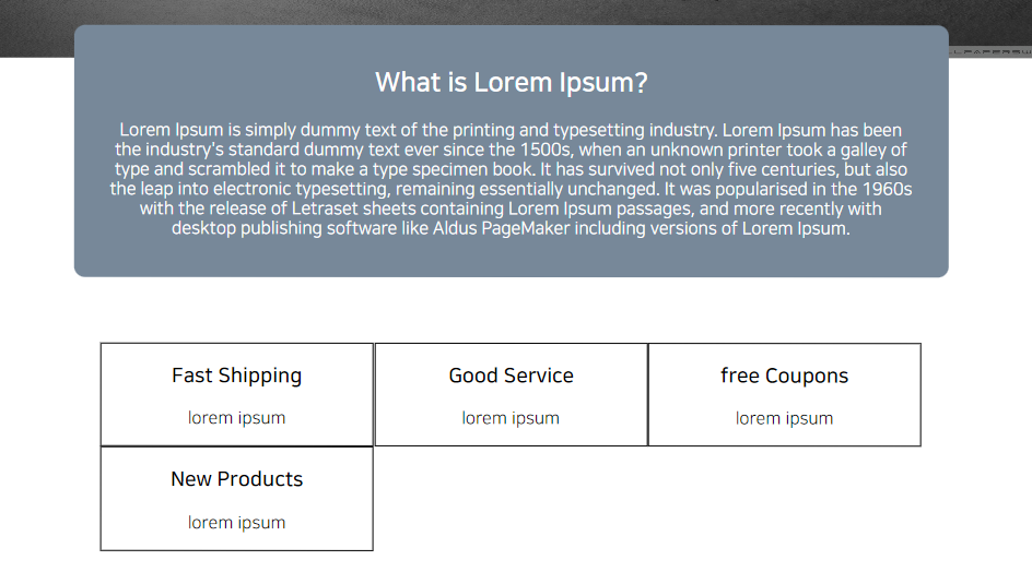
PC 화면에서는 nowrap 속성으로 박스들 경계가 닿아도 넘치지 않도록 구현했고
태블릿 화면(1200px)에서는 wrap 속성을 줘서 과제를 구현하려고 했는데
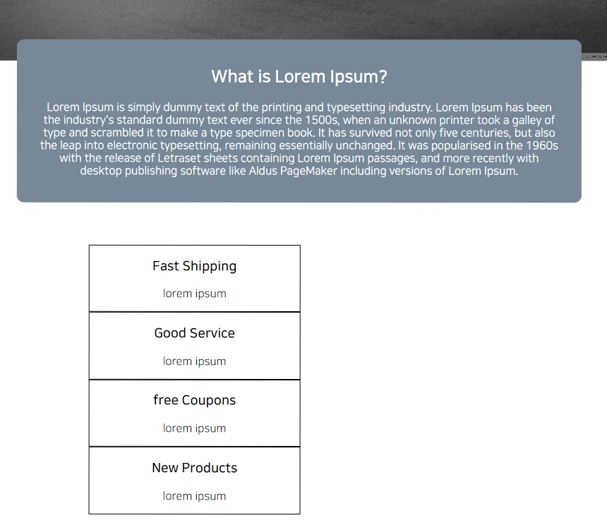
모바일 화면(768px)으로 넘어가기 전의 769~916px에서는 2번 사진처럼 배열이 저따구로 가버리네요
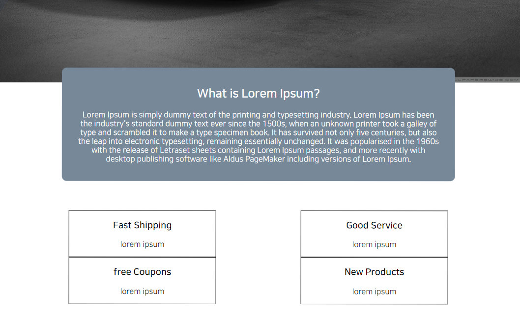
그렇다고 박스들의 폭을 250px 정도로 줄여버리면 1000px을 넘어간 시점에서 밑의 사진처럼 나옵니다
애플맨 도와줘요...
 가 2 년, 9 월 전에 전에 마지막으로 업데이트했습니다.