HTML페이지
<div class="main-box">
<div class="main-container">
<div class="main-text">
<h1>Lading Page for Apps</h1>
<p>Lorem ipsum dolor sit amet, consectetur adipisioing elit.</p>
<button class="btn-form">Show More</button>
</div>
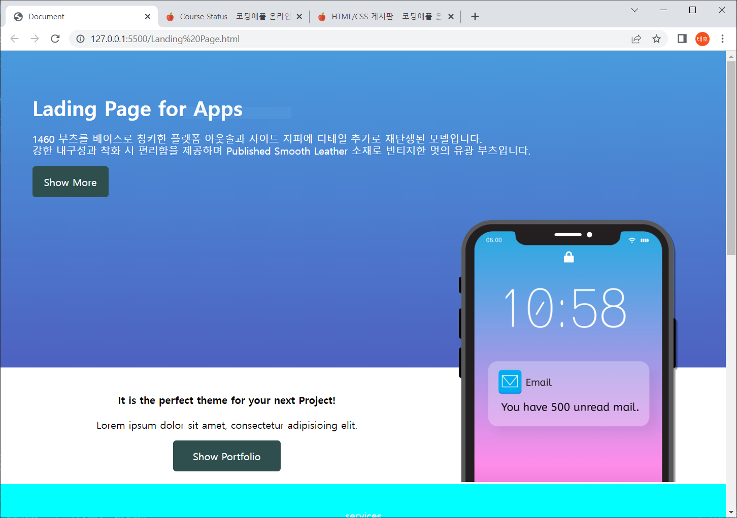
< img src="./img/iphone.png" class="image-box">
</div>
</div>
CSS페이지
.main-box{
    background-image: linear-gradient(to bottom,#499add,#4e61c0);
    height: 500px;
    padding: 50px;
    color: white;
}
.main-container{
    margin: auto;
    max-width: 1200px;
}
.main-text{
    float: left;
}
.image-box{
    float: right;
    width: 400px;
    margin-top: 15px;
}
미디어쿼리부분
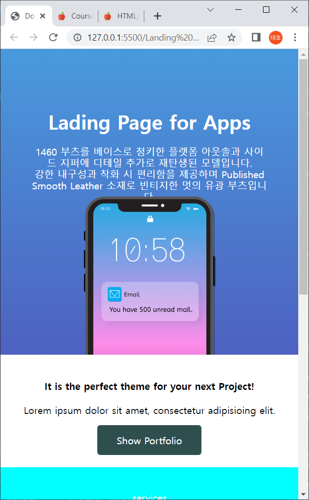
@media screen and (max-width:576px) {
    .main-box{
        position: relative;
    }
    .main-text{
        text-align: center;
        float: none;
        margin-top: 50px;
    }
    .image-box{
        margin: auto;
        width: 250px;
        display: block;
        position: absolute;
        bottom: 0;
        left : 0;
        right : 0;
        margin-left : auto;
        margin-right : auto;
        margin-top: 42px;
    }
}
이런식으로 미디어쿼리를 구성한후 사이트를 576px 까지 줄여봤는데 줄어지는 과정에 main-box가 아닌 밑에 서브텍스트라는 클래스로 구성한 div박스까지 내려가버립니다. 해결 방법이 있을까요..
 다 줄였을때 이부분도 해결팁이 있다면 주시면 감사하겠습니다 ㅠㅠ
 가 3 년, 1 월 전에 전에 마지막으로 업데이트했습니다.